How to Write Ad Copy Like A Pro

This was originally posted in February 2021 and has been updated in June 2021.
With the average consumer being served up thousands of branded messages each day, the competition for their attention couldn’t be higher. Therefore, for your advertising copy to have any chance of sticking in their mind, it must be as easy as possible for them to imagine. Keep reading to find out our killer ad copy tips to help you write them like a pro.
How to Write Ad Copy
1. Draw From Experience
Every product or brand has its own unique story. As an ad copywriter it’s your job not just to tell it, but do it in a way that’s original, fresh, and extremely digestible. One effective way of making your writing easier for the audience to grasp is by leveraging concrete language in the making of your ads. By doing so, you assist your audience in connecting to the idea by giving them a precise point of reference to envision.
Let’s take coffee, for example, far and away the most popular morning beverage in the history of the world (possibly). Americans consume an estimated 400 million cups of it every day, and according to the Huffington Post nearly half of all coffee consumers would rather skip a shower in the morning than forgo their first cup.
Now imagine you’re tasked with creating an ad for your company’s brand of everyone’s favorite day-starter. Where do you begin? What is it about your coffee that makes it different and why should customers care? After all, there’s no shortage of alternatives. Maybe it’s bolder than the others and with twice the amount of caffeine? That’s a good start, however, does “an extra bold coffee with twice the amount of caffeine” really make any kind of a lasting impression?
Seriously, close your eyes and repeat that line again, “an extra bold coffee with twice the amount of caffeine.” What do you see? Probably a stock image of coffee that you might find in one of those off-white ceramic cups at a diner. In other words, coffee that’s generic, unmemorable, and with absolutely no personality.
Don’t be surprised when your art director comes back to you with some boring picture like the one we just described to go along with your less-than-inspiring words. As the writer, you’ve given nothing concrete for anyone to work with, be it a consumer hearing your line on the radio, or the person responsible for designing the accompanying visuals.
2. Analogies Are Your Ad Copywriting Friends
If you think about it, surely there are some concrete things you can come up with that sets your coffee apart, and this is where the magic of analogies shines bright. Because an analogy is a way of saying something is like something else to illustrate a point, the use of similes makes them easy to come up with. A great way to get started is to turn what you want to say about your product into a game of mad libs, and then channel your inner “grandmother on Facebook for the first time” and (figuratively speaking) start “liking” everything. For example:
Like the ______ of _____.
Like if your ____ had a _____.
Like a _____ for your _____.
Now let’s apply that to your coffee and see what happens. As we mentioned before, it’s extra bold and with twice the caffeine, meaning it’s super-strong like it’s on…steroids.
Like your morning coffee on steroids!
Yes it’s a little bit more than cliché, but at the very least it conjures up a pair of flexing muscles slapped onto that mug, and now provides your audience with a visual point of reference.
3. Keep Grinding
As we’ve just seen, making similes out of your messaging is a quick and easy way to create analogies, and sometimes it’s enough. However, in other cases there may still be work needed if you want your ad copy to really stand out. One helpful way to do this is to delve into the mind of your audience. Ask yourself some questions. Why do people drink coffee? When and where do they drink it? What does it do for them?
Think about the answers. Presumably most people drink coffee in the morning for an energy boost to get them moving and ready to take on the day ahead. That seems pretty clear, but it’s more wordy than concrete. We need to dig a little deeper.
“A burst of energy to get you moving.” That sounds a lot like “fuel” which also serves to get you moving. So let’s take it and the rest of our idea and make it into a new analogy:
Like fuel that gets you out the door in the morning and off to work.
Ok, still wordy, but “fuel” is a little more concrete than “burst of energy,” meaning it can be interpreted visually a lot easier.
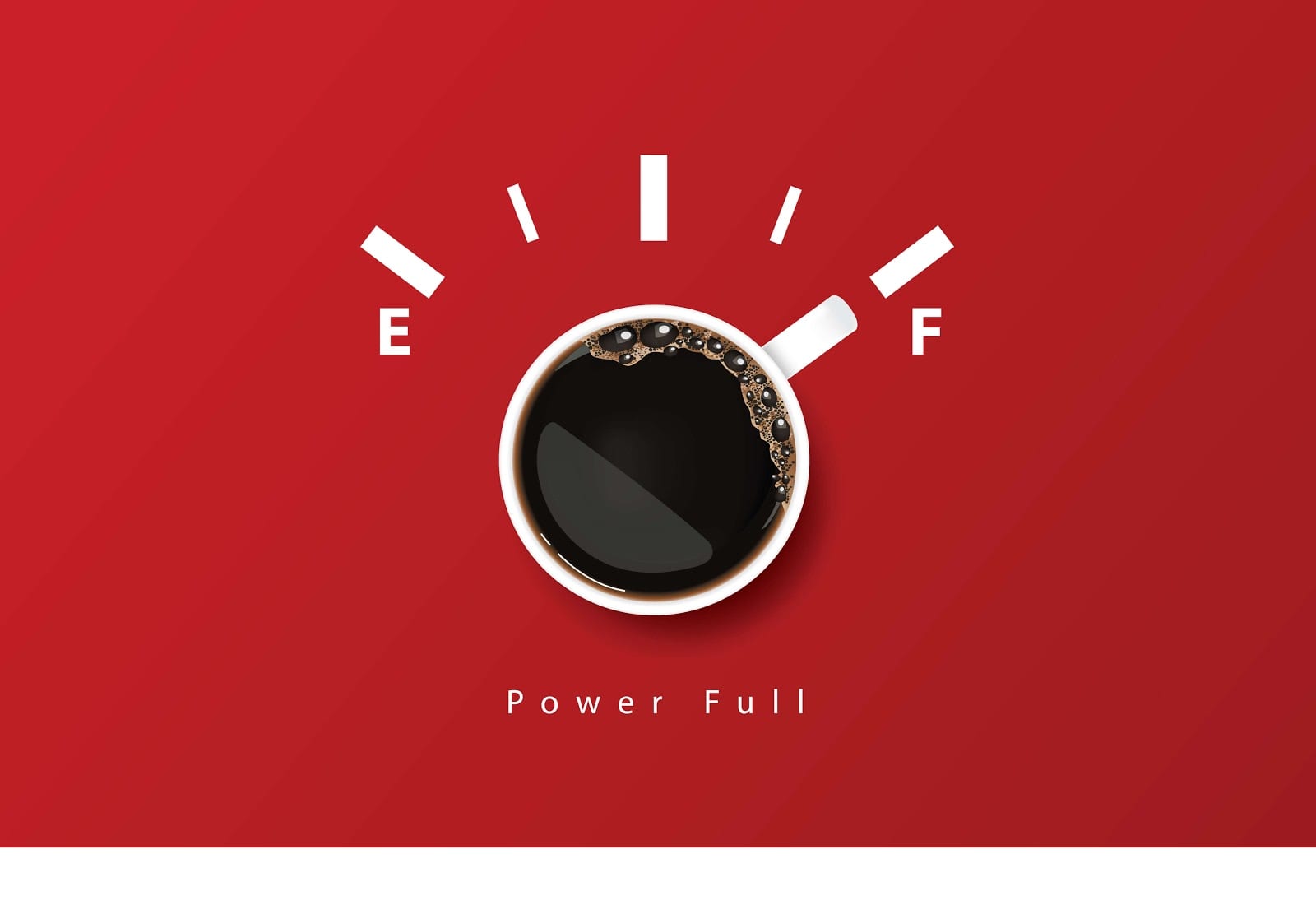
Next, let’s take a look at the second half of your answer: “out the door in the morning and off to work.” Again, is there any other way to say that more succinctly? Perhaps “fuel” can provide a visual queue. For example, what comes to mind when you hear the word “fuel?” Chances are you’re thinking of a car, which is how many people get to work on their…morning commute.
Like fuel for your morning commute!
Ok, now we’re really getting somewhere (pun intended). We’ve crafted a nice, tight line of advertising copy that gets the message across, and best of all paints a mental image. However, we’re not quite done yet, as it’s still a bit too generic. After all, the idea that coffee is fuel for your morning commute can be true about pretty much any brand. Is there anything about yours that you can call attention to that will help set it apart from the competition? Better yet, is there a way you can do it that conjures a mental image?
4. Call It As You See It
Let’s look back at your original coffee description to see if we can find some inspiration for a way to set it apart: “extra bold with twice the caffeine.” In other words, this “fuel” is really strong. You might say it’s “high octane,” like the type of fuel used to power a racecar. If that’s not strong enough, how about “jet fuel?” Still not strong enough, how about “rocket fuel?”
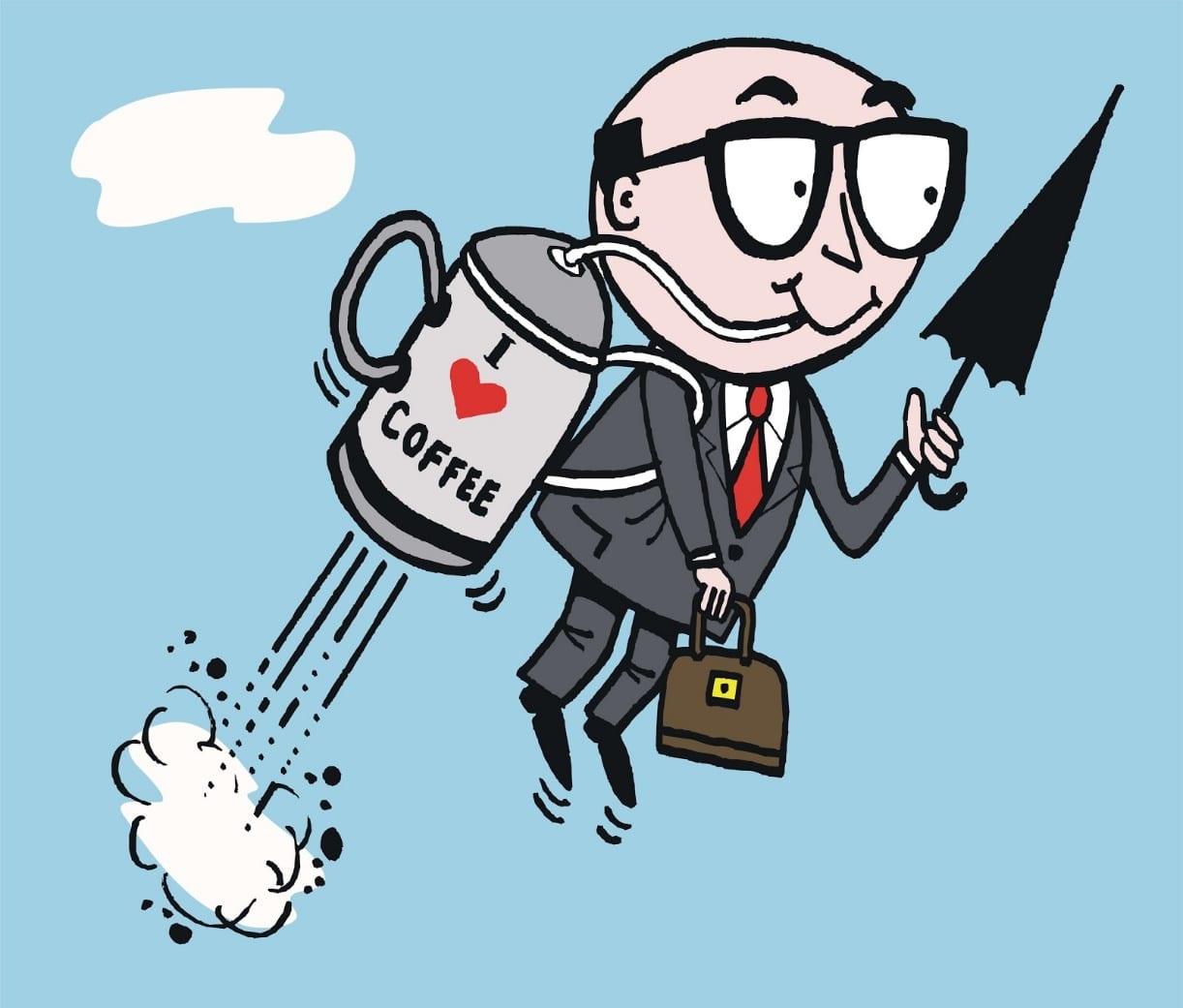
Like rocket fuel for your morning commute!
or even more to the point:
Rocket fuel for your morning commute!
Sounds like a pretty good line, and it wasn’t really that difficult to come up with either. Now, will it win you a Cannes Lions Award for creative excellence? Most likely not, however, it does check all the boxes for effective ad copy examples that put a visual image in its reader’s mind. Plus, it gives your art director more to work with when deciding on the ad’s creative direction.
Key Takeaways
In the words of advertising innovator Howard Gossage, “People don’t read ads. They read what interests them, and sometimes that’s an ad.” Follow our steps for how to write ad copy above and you’ll be on your way to making your ads precisely what people are interested in.
- One effective way of making your advertising copy easier for your audience to grasp is using concrete language in the making of your ads.
- Concrete language provides your audience with a mental image by giving them a familiar point of reference.
- Analogies are great at accomplishing this, and can even do much of the heavy lifting for you.
- Using poetic devices such as similes is an easy and effective way to create analogies, just be careful not to wade into the cliché.
- Get into the mind of your audience and then paint them a picture showing how you help solve their problem. If you can’t “see it” when you close your eyes, you’re not done yet.
- Use specific details and other identifying information in your wording to provide your audience a more sensory experience.
Extra Ad Copy Tips for Converting Users
- Solve their problems: as soon as you identify what they’re looking for, you can provide a solution to their issue. After all, a user is only going to be motivated to click your ad if there’s something in it for them. As an ad copywriter, ask yourself what your user wants to achieve and how you can meet their request.
- Be timely/ topical: to increase the conversion value of your ad, it can be created around a current event, trendy topic or particular season. Whether that’s Black Friday, Thanksgiving, the SuperBowl or a presidential inauguration, if it’s what everyone’s talking about…why not join in on the action? Relevance and “freshness” of ads is way more appealing to users than ones that feel outdated.
- Appeal to users’ emotions: when a user is simply scrolling down their Facebook, they’re not looking for your app. That’s why you’ve got your work cut out trying to grab them, and triggering their emotions through Facebook ad copy is a great way to go. The same goes with any other social media platform. You can play on their FOMO, trigger excitement and joy, or bring up feelings of nostalgia. Whichever route, it’ll make your users far more likely to convert.
- Instead of just describing your app, think about what emotions it can instil, too. To do this, you’ve got to first define who your target users are and establish your messaging.
- FOMO (fear of missing out) is a particularly good emotion to trigger because it has strong persuasive value. Nobody wants to feel like they’re missing out, right? If you give your users’ a reason to believe this might happen to them if they don’t download your app, then they’re probably going to download it.
- Data is your friend: before you begin, you must identify certain crucial factors. Without research and data to back up your ad copywriting, you’re setting yourself up to fail. Just because you believe your ad copy works well, doesn’t mean it will actually perform well.
- Who are you writing for?
- How does that person think/ behave?
- What does that person need?
- What ads does that person usually respond well to?
- Use tools to aid the above: there are many tools that exist to help you here. You can A/B test creatives with SplitMetrics, find the questions everyone’s asking at Answer The Public, look at your analytics on the social media platform you’re advertising on, etc.
Bad Ads vs Good Ads
We’ve already covered our top tips for writing more imaginative ads, but here’s a bonus section on best practice when it comes to the overall ad – and how the ad copy interplays with the visual elements.
1. What Makes A Good Ad – KPIs & Pain Points
Blending together the campaign KPIs and the target customer’s pain points is essential for the most effective ads. Often, one of the main KPIs is more downloads, but other times it can simply be increased brand awareness or increased social media following. Being creative about how to merge the two concepts is where it’s at.
We like ads that simply identify an appealing factor for the target user, deliver it with a touch of humor and a call to action that is straight to the point.
2. What Makes A Good Ad – Font & Size
You’ve worked hard to get the copy spot on, now it’s time to consider the placement, capitalization and size of your copy within the overall ad. Certain phrases will need more emphasis than others, and that doesn’t just have to be achieved by the text alone. There can be visual aids in play, too, by making them a different color, or a bolder or bigger font.
3. What Makes A Good Ad – Tone
Sometimes, depending on the brand, it pays to be straight to the point and more serious in tone. This doesn’t mean you can’t be creative, but an overall more formal tone might match the branding or resonate with their target audience better.
4. What Makes A Good Ad – Less Words More Creativity
Other times, it’s ok to let the picture/ creative do most of the talking. You can be effective and get your point across in as little as one word. If you carefully select that one word to match the imagery, they become the perfect partners to achieve campaign success.
What Makes A Bad Ad?
This may be subjective, so it’s hard to determine exactly. What we can do is give you a few examples of things we try to avoid when it comes to creating the overall ad, copy included.
- Avoid stereotyping: We’re in 2021 and it’s so not cool (or acceptable) to be portraying archaic gender stereotypes or anything similar with your ads. We’ve all seen those campaigns where we wonder how the messaging got approved, famously the Yorkie chocolate bar campaign that ran for years in the UK – attaching the tagline “It’s Not For Girls” or “Not Available in Pink” to all of their ads and packaging. Don’t follow in their footsteps.
- Overcomplicating: Be creative, but don’t be complicated. Use as little words as you can to portray your point. The more words, the more work the target user has to do in reading them, and the less likely they are to convert. Social media and apps are a very visual sphere, so keeping words to a minimum – and simple to understand – is often the most effective way.
- Too many distractions: If the campaign really is about the words, then too many visual elements can distract. Sometimes when you’ve got an absolutely killer line, it can be good to let it shine. Simple block colors can help.


