Updated February 25, 2020
With billions of active users searching Google’s Play Store each month, Google continues to enhance the overall app discovery experience.
Each time the technology giant modifies the Play Store more than just users are affected by the changes. It’s important for app developers and ASO managers to stay on top of these updates to both improve their listings and avoid harmful pitfalls. In its first update Google implemented design changes to accommodate a better browsing, as well as improve organic explore traffic and screenshot legibility. Now in its latest phase of the makeover the company has addressed the way in which preview videos are presented that includes two exciting new features. We expect even more changes to come, but in the meantime here’s an overview of the reboot to date.
Google’s Material Design
Google Play’s comprehensive visual redesign dovetails perfectly with Google’s Material Design which they developed in 2014. Material Design employs more grid-based layouts, responsive animations, and transitions in order to support onscreen touch interfaces.
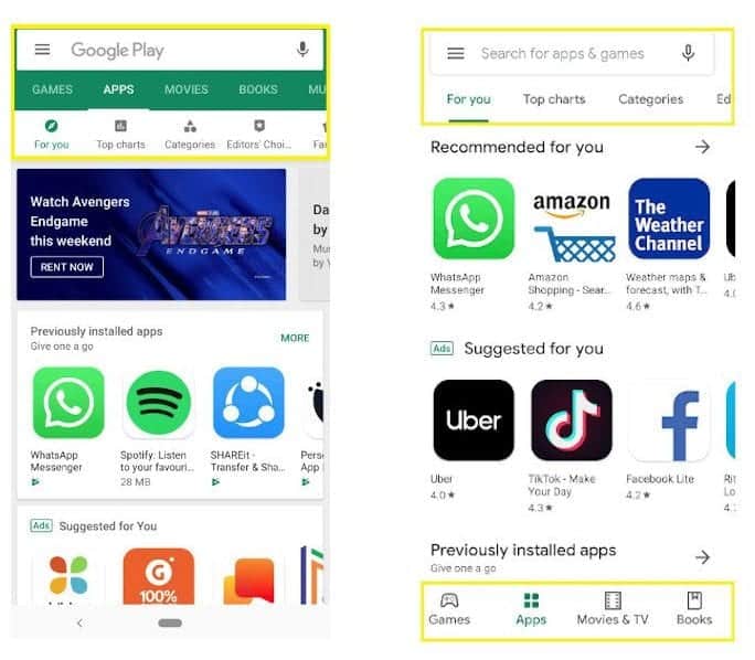
Boris Valusek, Design Lead for Google Play recently stated: “Aligning with Material Design language, we are introducing several user-facing updates to deliver a cleaner, more premium store.” Consequently, the boxy green navigation bar at the top of the store has been replaced by a simpler one.
Google designers have been busy optimizing the UX of all of Google’s services and products. Some of these changes have included 3D effects, padding and depth effects such as lighting and shadows. At last, Google Play Store’s visual and UX refresh has finally rolled out. Interestingly enough, it looks a little like Apple’s 2017 revamp has influenced their alterations!
New Navigation Bar Is Easier to Use
The new left navigation on Chrome OS and tablets increases browser speed and makes the interface easier to use.
Google split the navigation bar at the top of the store in an effort to create a more responsive and clear experience. Previously the search bar, categories and subcategories were all crammed together at the top of the store.
This new bottom navigation has the main listings Games’ and ‘Apps’ plus the new listings ‘Movies & TV’ and ‘Books.’ Music. however, is apparently gone and they’re planning on replacing Google Play Music with YouTube Music.
Google relocated new subcategories for each listing to the top of the store under the search bar. This makes it easier for users to browse apps by category, and discover apps more specific to their interests. For games, there’re new tabs ‘Events’ and ‘New’ in addition to ‘For you, Top Charts, Premium, Categories, Family, Editor’s Choice.’
According to App Annie, mobile games account for over 30% of app installs. Is is true that other apps are installed more frequently, however, mobile games represent over 74% of consumer spending on apps.
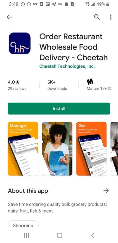
Once a shopper is interested in a particular app the updated Google Play Store layout offers more app information at the top of the page.

BEFORE and AFTER
The call-to-action button is higher and more visible which makes vital details able to be absorbed more quickly. Additionally, the opportunity to install is more visible for the decision-maker. Titles are now larger and bold, enticing users to click on titles such as ‘Recommended for You.’
Google spared no attention to details on its new uniform icons in the Play Store’s updated layout. They look amazing. Keep in mind that since June 24, 2019, all uploaded icons must be compatible with the new icon design specification.
Play Store Videos Are Now Inset
Previously preview videos incorporated as part of an app listing would take a user to YouTube in order to be viewed. With the new and improved Play Store experience, Google no longer takes users away from the Play Store in order to watch them. Instead, Google has made these videos playable inside a window within the app page, making for a more streamlined experience for curious users.
Play Store Videos Play Automatically
Not to be overlooked, Google made another change to accompany the Play Store’s cleaner look. Videos now play without sound automatically in the app and game listings to quickly showcase content. Additionally, the auto-play enhancement also has special implications when it comes to brand-related keywords. Now when a branded search is made the video in the main result will also auto-play just a few seconds after it showing up onscreen. Thankfully, Google required developers to disable all ads in their Play Store listings by November 1, 2019 in order to prevent users from seeing ads before promo videos begin!
Play Store Change Implications
The short description has been re-located beneath the first screenshot entitled: ‘About this app’ or ‘About this game.’ There is a short description beneath this CTA that can only fit 80 characters. It’s interesting to note that the Material Design elements add considerable padding. As such, the short description now has more distinct real estate and thus more visibility.

Google also reduced the screenshot real estate for both landscape and portrait images, as well as videos. Will this compel users to click the screenshots for a closer look? Perhaps, however, copy needs to be reduced in order to accommodate larger, more attention-grabbing fonts.
With copy length been reduced it’s more important than ever to compose microcopy that is both concise and powerful. With only a few words to tell the app’s story, benefits and features must be explained and highlighted carefully. Choose each word carefully to match the images highlighting the app’s main benefits and unique selling propositions (USP).
Ultimately, app discover-ability should increase with Google Play Store’s redesign. This will help get the right apps in front of the right people, making installation decisions faster.
Despite all these changes, however, we anticipate the Google Play Store will surely be tweaking its redesign further. So with that in mind, stay tuned and we will keep you updated regarding any important changes that occur.


