The Challenge of Drawing Attention to Your App
Here’s the challenge. On the one hand, there are millions of apps out there, and it’s becoming increasingly difficult for your app to stand out and grab your deserved share of downloads. On the other hand, standing out is not easy – conventional wisdom says that there is limited scope to stand out on your app’s product page in the app stores, given the limited spacing and app store rules and regulations.
We’d like to argue that it’s precisely by facing these limitations and thinking out of the box, that your app can stand out. It comes down to being creative, especially with your creatives.
Let us explain.
How can we help?
For more questions, or to speak to expert mobile marketers here at Moburst, please don’t hesitate to get in touch.
How to Make Your App Stand Out by Getting Creative
An app store listing is almost the opposite of a website. On your website, you can choose fonts, structure, and colors – and you can place these elements wherever you like.
On the app stores, however, none of these choices are available. There are set opportunities, and you have to maximize these. Much like in climbing a sheer cliff face, a mountaineer has to use every tiny crevice available, so too when it comes to success in the app stores: the apps that ultimately triumph are those that use every opportunity available to be creative.
While every single element of your app’s product page listing can be optimized creatively, in this piece, we’ll focus on the major creative elements, namely the app icon and screenshots.
App Icon
Your app icon is the first thing a user notices about your app. This is your first opportunity to get creative. Ensure your app icon contains these critical elements:
- Conveys the emotion you want your users to connect with
- Is instantly recognizable
- Stands apart significantly from competitors
- Is clean and not cramped
- Looks great on all device types and sizes
- Is fully tested to ensure that it is the most powerful version possible
Apple has some great practical design tips when it comes to your app’s icon. These include:
-
Provide a single focus point, with an icon that has a single, centered point that immediately captures attention and clearly identifies your app
-
Keep the background simple and avoid transparency
-
Avoid text or full words, and photos
-
Avoid imagery of hardware products, as these can change often and if not updated can make your app icon look dated
-
Test your icon against different wallpapers, by trying it on an actual device with a dynamic background that changes perspective as the device moves
Screenshots
The number one rule when it comes to screenshots (and all creatives, for that matter)?
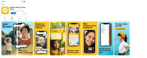
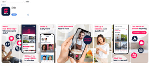
Excite your audience! They’re bored of seeing the same types of screenshots over and over again. Force them to look again. Jump out from the screen. Pull them across the screenshots with a cohesive storyline. Create something different, something memorable. This is where getting creative with your creatives can pay dividends!
Add up to 8 screenshots on the Play Store, and 10 on the App Store, to convey what your app is all about, and most importantly, your key value proposition: why users should download your app immediately. Remember:
- Ensure you’ve uploaded all the possible sizes of a screenshot so that your app can take advantage of all the recommendation features of the app stores.
- Carefully consider how many screenshots appear in searches, on your app store listing page, and in other ways users might interact with your app.
- Think of your screenshots from the user’s perspective – focus on what they want, not on what you can offer (benefits rather than features)
- Localize: this can make a huge difference to download statistics, and bear in mind that localization is more than just translation – different languages and cultures value very different things when it comes to your app’s offering
App Preview Videos
On both the Apple App Store and Google Play Store, app previews allow you to give users a sneak peek into your app’s functionality, and this is a great opportunity to get creative with your creatives! On both app stores, videos may autoplay or the user may have to tap the video to play it. Here are some top tips for getting started:
Start Strong
The first 3 seconds are critical: this is crunch time for grabbing attention, drawing in the user, and making them say, “Wow!” If you don’t have them hooked within those 3 seconds, you’ve lost them. When videos don’t autoplay, ensure that the image displayed is compelling and that it makes sense in the context of your overall creative strategy.
Sound is a Bonus
The video must stand by itself without sound: as app preview videos autoplay on mute, you have to assume that the majority of users will be watching without sound effects. This also means that your video has to work a lot harder.
Tell a Story
There’s nothing like a cohesive story to draw a user in and have them watching to the end. Once you’ve started strong, you have to continue with a systematic approach to ensure users don’t abandon your video.
Bonus
The app stores are continually updating the features and functionality available, and by extension are constantly adding opportunities for you to get creative with your creatives. Just a few of these recent examples include:
-
Apple’s Product Page Optimization and Custom Product Pages. Product Page Optimization allows you to try multiple versions of your app’s product page with different icons, screenshots, and app previews, to assess which of these drives the best results. Custom product pages enable you to create additional versions of your app’s product page, with each one highlighting different features or content, which can be accessed through specific URLs that you can use in different contexts.
-
Google recently announced that it too is launching versions of these features. With this said, Google Experiments gives you the opportunity to run A/B tests on your store listing, and optimize each element, including the custom store listing page.
-
Use creative in-app events to drive downloads! These are now viewable directly within the App Store.
Get Creative with Your Creatives to Stand Out
Yes, opportunities to get creative within the app stores are limited. But this just means you have to be even more creative to stand out! As the famous saying goes, “Limitations foster creativity”. We’d like to suggest an updated version: “Limitations necessitate creativity.”
By getting creative with your creatives, thinking outside the box, and differentiating yourself from your competitors, you will make your app stand out and hit those KPIs.
How can we help?
For more questions, or to speak to expert mobile marketers here at Moburst, get in touch.


